Introduction 之前有一篇学习Unity Editor相关的知识:UnityEditor知识
UIToolkit作为Unity最新一代UI系统,这里准备单独用篇来学习记录,通过深入学习UIToolkit,为后续编写一套节点系统做准备(用于AI系统,剧情系统和引导系统实现)。
Note:
本章节重点是UIToolkit在Editor上的学习使用,Runtime目前看来UIToolkit还不够成熟,不适合用到Runtime(2023/5/20)
UI Toolkit is the newest UI system in Unity. It’s designed to optimize performance across platforms, and is based on standard web technologies. You can use UI Toolkit to create extensions for the Unity Editor, and to create runtime UI for games and applications (when you install the UI Toolkit package.
看官方介绍可以看出,UI Toolkit是官方推的新一代UI系统,基于Web技术概念的一套UI系统,可用于Editor和运行时通吃。
UI Toolkit由三大部分组成:
UI system(Contains the core features and functionality required to create user interfaces. )
UI Assets(Asset types inspired by standard web formats. Use them to structure and style UI. )(个人理解类似UI布局文件Asset)
Tools and resources(Create and debug your interfaces, and learn how to use UI toolkit. )
UI system UI系统由以下部分组成:
Visual tree(Defines every user interface you build with the UI Toolkit. A visual tree is an object graph, made of lightweight nodes, that holds all the elements in a window or panel. )(定义UI界面的数据,包含了所有组成UI显示的成员节点信息)
Controls(A library of standard UI controls such as buttons, popups, list views, and color pickers. You can use them as-is, customize them, or create your own controls. )(UI组件)
Data binding system(Links properties to the controls that modify their values. )(关联数据属性到UI组件)
Layout Engine(A layout system based on the CSS Flexbox model. It positions elements based on layout and styling properties. )(类似CSS的UI布局系统)
Event System(Communicates user interactions to elements; for example, input, touch and pointer interactions, drag and drop operations, and other event types. The system includes a dispatcher, a handler, a synthesizer, and a library of event types. )(UI事件系统,负责事件的分发等)
UI Renderer(A rendering system built directly on top of Unity’s graphics device layer. )(在Unity基础上设计的UI渲染系统)
UI Toolkit Runtime Support(Contains the components required to create runtime UI. The UI Toolkit package is currently in preview. )
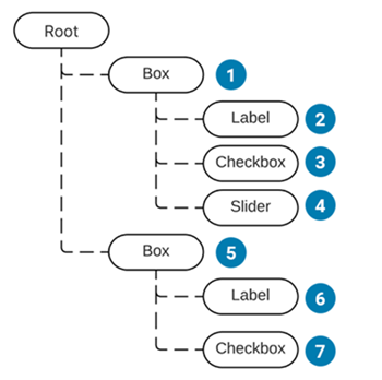
Visual tree Visual tree由VisualElement组成,VisualElement是所有UI Toolkit的节点基类,VisualElment包含了所有UI组件,排版,UI风格,UI事件处理等数据信息。
UI元素绘制顺序树广度扩展:
UIToolkit里的坐标系分为两种:
Relative(position: relative相对坐标系)
Absolute(position: absolute绝对坐标系)
上面两个坐标系和Unity里的相对位置和世界位置的概念差不多。
Note:
坐标原点在左上角 VisualElementExtensions的扩展方法里提供了坐标系转换相关的方法和接口
Layout Engine UI Toolkit includes a layout engine that positions visual elements based on layout and styling properties. (UI Toolkit的排版系统是基于VisualElement的排版和Styling属性设置决定的)
Unity Extensible Markup Language (UXML) files are text files that define the structure of the user interface. (Unity支持用UXML来描述UI界面组件数据)
可以使用UI Builder 实现可视化布局编辑。
UXML通过代码动态创建的数据对象类为VisualElementAssets。
UXML现有可用Element查询
UXML布局构建事例
深入使用,待学习……
Note:
You can’t generate a VisualTreeAsset from raw UXML at runtime.
Uity style sheets(USS) Style properties are either set in C# or from a style sheet. Style properties have their own data structure (IStyle interface). UI Toolkit supports style sheets written in USS (Unity style sheet). (Unity支持定义类似CSS的USS文件来定义UI界面使用的Style属性设置)
USS通过代码动态创建的数据对象类为StyleSheet
USS包含以下部分:
Style rules that include a selector and a declaration block. (个人理解Style定义包含选择器和内容定义)Selectors that identify which visual element the style rule affects. (选择器用于匹配Element的Style使用)A declaration block, inside curly braces, that has one or more style declarations. Each style declaration has a property and a value. Each style declaration ends with a semi-colon. (内容定义Style的详细配置)
USS Selector Style选择器分有很多种,简单的选择器有:
Type selector type selectors match elements based on their element types. (通过类型名字匹配)
1
2
3
4
Button { border-radius: 8px; width: 100px; }
1 <Button name="Cancel" text="Cancel" />
Note:
type selector的名字不允许包含命名空间
Class selector class selectors match elements that have specific USS classes assigned. (通过定义类名匹配)
1
2
3
.yellow { background-color: yellow; }
1 <Button name="OK" class="yellow" text="OK" />
Note:
calss selector大小写敏感且不允许带数字
Name selector name selectors match elements based on the name of an element. (通过名字匹配)
1
2
3
4
5
#Cancel { border-width: 2px; border-color: DarkRed; background-color: pink; }
1 <Button name="Cancel" text="Cancel" />
Note:
代码里可以通过VisualElement.name修改去匹配Name Selector
Universal selector universal selector, also called the wildcard selector, matches any element. (通过通配符(正则)去匹配)
1
2
3
* { background-color: yellow; }
1
2
3
4
5
<VisualElement name="container1"> <VisualElement name="container2" class="yellow"> <Button name="OK" class="yellow" text="OK" /> <Button name="Cancel" text="Cancel" /> </VisualElement>
更多复杂的选择器参考:
Complex selectors
USS properties USS property assigns a style or behavior to a VisualElement. (USS的内容属性用于给VisualElement指定具体显示配置)
USS data types Syntax - auto, ,等。
如果一个属性有多个值,可以如下方式表达不同含义:
Side-by-side表示全部都必须按顺序出现
|表示多个选择里必须出现一个
||表示1个或多个必须按顺序出现
&&表示所有都必须出现
[]表示一个选择组(类似正则里[]的概念)
上面提到的属性多个值都支持类似正则里*,+,?,{A,B}的后缀描述,表达的含义也就是类似正则里的出现次数控制。
Length - 支持像素(px)和百分比(%)两种长度单位
initial - 全局关键词,标识重置属性到初始默认值
Color - 支持16进制(#FFFFFF)和rgb表达方式(rgba(255, 255, 255, 1))
Color关键词详情查看:
USS color keywords
Assets - 支持引用项目里的资源,resource()(标识使用Resources目录资源),url()(标识使用项目Asset资源,支持相对USS所在目录的相对路径和项目相对路径)
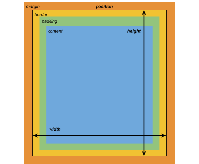
USS common properties 在了解一些常规布局属性概念前,让我们先来看看官网给的一张示意图:
宽高属性 width(宽度),height(高度),min-width(最小宽度),min-height(最小高度),max-width(最大宽度),max-height(最大高度)……
边缘(Margins)属性 margin-left(左侧边缘),margin-top(顶部边缘),margin-right(右侧边缘),margin-bottom(底部边缘)……
边界(Border)属性 border-left-width(左侧边界),border-top-width(顶部边界),border-right-width(右侧边界),border-bottom-width(底部边界),border-color(边界颜色)……
内边距(Padding)属性 padding-left(左侧内边距),padding-top(顶部内边距),padding-right(右侧内边距),padding-bottom(底部内边距)……
排版属性
Items
flex-grow(排版放大设置)
flex-shrink(排版缩小设置)
flex-basic(排版大小设置)
align-self(自身对齐设置)
……
Containers
flex-direction(子成员排版对齐方向)
flex-wrap(子成员放不下是否多行显示排版)
align-content(子成员在排版方向上的对齐方式)
……
位置属性 position(位置坐标系-绝对|相对),left(距离父容器左测距离),top(距离父容器顶部距离),right(距离父容器右侧距离),bottom(距离父容器底部距离)……
UIToolkit里的坐标属性有两种坐标系:
绝对坐标
相对坐标
Note:
设置了Left,Top,Right,Bottom后,Width属性相关设置会被忽略。 绝对坐标适合一些固定位置的弹窗,绝对坐标确定位置后,内部用局部坐标排版UI显示
背景属性 background-color(背景颜色),backtground-image(背景图片),-unity-background-scale-mode(背景图片缩放模式),-unity-background-image-tint-color(背景图片色调?)……
九宫属性 -unity-slice-left(左侧切割数值),-unity-slice-top(顶部切割数值),-unity-slice-right(右侧切割数值),-unity-slice-bottom(底部切割数值),-unity-slice-scale(九宫缩放值?)……
Appearance(外观)属性 overflow(溢出显示设置),-unity-overflow-clip-box(溢出裁剪box设置),-unity-paragraph-spacing(段落间隔设置),opacity(透明度显示设置),visibility(可见性设置),display(排版显示设置)……
文本属性 color(绘制颜色设置),-unity-font(绘制文本字体设置),-unity-font-definition(?),font-size(字体大小设置),-unity-font-style(字体风格设置),-unity-text-align(字体对齐设置),-unity-text-overflow-position(?),white-space(空格处理方式设置),-unity-text-outline-width(描边宽度设置),-unity-text-outline-color(描边颜色设置)……
详细USS properties查看:
USS properties reference
W3C CSS的详细属性效果查看:
CSS
Note:
USS properties use the same syntax as W3C CSS documents (USS的内容属性采用W3C CSS相关文档规则)The USS display property supports only a small subset of the CSS display property’s available keyword values. (USS的属性支持只是CSS的很小部分子集)
USS custom properties USS variables, also called custom properties, define values that you can reuse in other USS rules. You can create variables for any type of USS property.
可以看到USS支持在USS文件里自定义变量,然后像编程里的变量一样,一处定义多处使用。
USS自定义变量规则如下:
–变量名:值
USS自定义变量在其他USS文件访问规则:
var(–变量名, 默认值(可选))
内置自定义变量查询:
USS built-in variable references
Best practices for USS 官方关于使用USS Style的建议:
Avoid inline styles(个人理解是使用全局USS File,避免对单个Visual Element设置Styles(会导致耗费更多内存)) Selector architecture consideration(选择合适的selector方案,过多或过于复杂的selector方案会导致运行时选择style开销更大)
更多建议参考:
Best practices for USS
Theme Style Sheet(TSS) Theme Style Sheet (TSS) files are regular USS files. UI Toolkit treats TSS as a distinct asset type and uses it for management purposes.
更多学习,待添加……
Query Elements Unity提供了Query功能(类似Linq),方便用户快速从VisualTree或Elements里查找符合条件的Element。
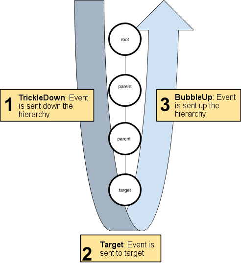
Event System Dispatch Events UIToolkit Event System监听系统事件,然后通过EventDispatcher派发事件给Visual Element。
所有的事件派发都会经历以下三个阶段:
Trickles down: Events sent to elements during the trickle down phase. (个人没太理解这个阶段,感觉是一个事件捕获从上往下 派发事件的过程(不含响应事件的最里层Visual Element )Bubbles up: Events sent to elements during the bubble-up phase. (事件从目标节点向上冒泡派发给Visual Element的,即最里层符合的Visual Element最先派发(从下往上 )(含响应事件最里层Visual Element ))Cancellable: Events that can have their default action execution cancelled, stopped, or prevented. (事件是可取消的,比如一般的事件冒泡为了不继续想外层冒泡,我们会设置事件阻断防止继续冒泡)
通过上面的介绍可以了解到,事件派发有两个流程(Trickles down & Bubbles up),在不打断事件派发的前提下,最里层响应Visual Element只会派发一次,其他外层传递路线上的Visual Element会派发两次事件。
事件基类为EventBase,所有相关事件介绍参考:
Event reference
Note:
The UI Toolkit event system shares the same terminology and event naming as HTML events (UIToolkit采用和HTML一样的事件名和术语)
Handle Events 事件处理顺序如下:
Execute event callbacks on elements from the root element down to the parent of the event target. This is the trickle-down phase of the dispatch process. (事件捕获阶段从上往下触发事件)Execute event callbacks on the event target. This is the target phase of the dispatch process. (在目标响应Visual Element上触发事件)Call ExecuteDefaultActionAtTarget() on the event target. (在目标响应Visual Element上触发ExecuteDefaultActionAtTarget()方法)Execute event callbacks on elements from the event target parent up to the root. This is the bubble-up phase of the dispatch process. (从目标Visual Element开始向上冒泡触发事件)Call ExecuteDefaultAction() on the event target. (在目标响应Visual Element上触发ExecuteDefaultAction()方法)
事件响应里有两个重要的概念:
By default, a registered callback executes during the target phase and the bubble-up phase. This default behavior ensures that a parent element reacts after its child element. (默认状态下,我们注册的事件回调是在target phase和bubble-up phase阶段执行。这是为了确保事件回调触发是从下往上)
如果我们想在指定阶段(e.g. tickle-down phase或bubble-up phase)触发注册事件回调,我们需要在注册事件回调处,显示传参说明响应阶段:
1
2
3
VisualElement myElement = new VisualElement(); myElement.RegisterCallback<MouseDownEvent>(MyCallback, TrickleDown.TrickleDown);
如果我们想事件传递自定义数据,我们需要自定义一个含自带数据的方法回调并监听事件:
1
2
3
myElement.RegisterCallback<MouseDownEvent, MyType>(MyCallbackWithData, myData); void MyCallbackWithData (MouseDownEvent evt, MyType data )
相关事件信息查询:
Event Reference
SerializedObject Data Binding A binding refers to the link between the property and the visual control that modifies it. (数据绑定是用于快速关联UI组件和数据属性,实现UI组件快速修改数据属性)
数据绑定要求:
数据绑定只支持可序列化的属性或类(e.g. ScriptableObject, MonoBehaviour, int, bool, float, Vector3, Color, Object……)
You can only bind the value property of visual elements that implement the INotifyValueChanged interface. (值绑定Visual Element只在实现了INotifyValueChanged接口的组件允许)
You can bind between an object and any visual element that either derives from BindableElement or implements the IBindable interface. (object绑定Visual Element只在继承BindableElement或实现了IBindable接口的组件允许)
数据绑定接口:
Bind() - 绑定VisualElement到指定ScriptableObject
调用Bind前需要设置bindingPath指定哪些属性需要绑定
Unbind() - 解绑VisualElement(含子VisualElement)
EditorWindow关闭会自动解绑,我们只需要在绑定不同数据来源时调用Unbind
bindingPath - 给VisualElement指定需要绑定的属性
bindingPath就是绑定属性的名字
BindProperty() - 绑定VisualElement到制定SerializedProperty
需要自定义哪些属性需要绑定显示的时候
TrackPropertyValue() - 检查指定VisualElement绑定的属性是否变化,变化后触发回调通知
TrackSerializedObjectValue() - 任何VisualElement绑定的属性变化时触发回调通知
官方建议:
自定义Editor或PropertyDrawer,建议使用bindingPath而非Bind()和BindProperty() 尽量避免多次对相同VisualElement调用Bind(),为性能考虑
Note:
SerializedObject data binding only works in the Editor, not at runtime. (SerializedObject的数据绑定只支持Editor模式不支持Runtime模式)bind a visual element to nested properties in the source object (VisualElement支持绑定到嵌套属性)Don’t call Bind() from the Editor.CreateInspectorGUI() or PropertyDrawer.CreatePropertyGUI() override. These overrides are called automatically on the visual elements that these methods return. (Editor.CreateInspectorGUI()和 PropertyDrawer.CreatePropertyGUI()里要调用Bind,在这两个方法返回后会自动Bind所有返回的Visual Elements)
UI Assets Unity提供了两种Asset用于布局系统
UXML documents(Unity eXtensible Markup Language (UXML) is an HTML and XML inspired markup language that you use to define the structure of user interfaces and reusable UI templates. )(类似HTML和XML的标记性语言,用于定义UI布局)
Unity Style Sheets(USS)(Style sheets allow you to apply visual styles and behaviors to user interfaces. They’re similar to Cascading Style Sheets (CSS) used on the web, and support a subset of standard CSS properties. )(类似CSS用于定义UI风格)
Unity提供了几个辅助工具,帮助我们学习和调试UI Toolkit
UI Debugger(UI调试器–可视化查看UI节点详细数据)
UI Builder(UI布局可视化编辑器(预览版本))
UI Samples(UI事例)
实战 接下来通过实战学习,进一步了解UIToolkit的使用和设计。
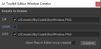
基础学习 代码+USS创建UI 代码创建UI UIToolkit为了帮助我们快速创建Editor UI窗口,提供了快捷创建入口:
Asset->Create->UI Toolkit->Editor Window
考虑到不适用UXML作为UI布局,使用纯代码写Editor UI,这里就不勾选UXML了。
创建完会看到生成一个*.cs文件和一个*.uss文件,这是因为我们勾选了C#和USS,接下来我们打开UICreateUIByCodeEditorWindow.cs开始我们的Editor UI代码编写,后续会讲到如何利用*.uss文件来指定UI风格。
UICreateUIByCodeEditorWindow.cs
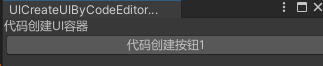
1
2
3
4
5
6
7
8
9
10
11
12
13
14
15
16
17
18
19
20
21
22
23
24
25
26
27
28
29
30
31
32
33
34
35
36
37
38
public class UICreateUIByCodeEditorWindow : EditorWindow { [MenuItem("Window/UI Toolkit/UIToolkitStudy/UICreateUIByCodeEditorWindow" ) ] public static void ShowUICodeStyleEditorWindow () { UICreateUIByCodeEditorWindow wnd = GetWindow<UICreateUIByCodeEditorWindow>(); wnd.titleContent = new GUIContent("UICreateUIByCodeEditorWindow" ); } public void CreateGUI () { CreateUIByCode(); } private void CreateUIByCode () { VisualElement uiContainer = new VisualElement(); Label uiTitleLable = new Label("代码创建UI容器" ); uiContainer.Add(uiTitleLable); Button btn1 = new Button(); btn1.text = "代码创建按钮1" ; uiContainer.Add(btn1); rootVisualElement.Add(uiContainer); } }
可以看到编写基于UIToolkit的Editor Window还是和以往一样,要继承EditorWindow,但实现GUI绘制的接口不是OnGUI()而是 CreateGUI() 。
正如前面提到的UIToolkit里绘制的对象Visual Tree是由Visual Element组成的树状结构。而EditorWindow.rootVisualElement正是UIToolkit绘制EditorWindow的根VisualElement ,我们所有的UIToolkit元素都是添加到此EditorWindow.rootVisualElement实现排版绘制的。
代码修改USS 所有的UIToolkit组件都继承至VisualElement,想通过代码修改UIToolkit组件的Style很简单,直接访问VisualElement.style即可。
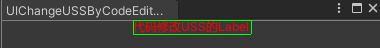
UIChangeUSSByCodeEditorWindow.cs
1 2 3 4 5 6 7 8 9 10 11 12 private void CreateStyleUIByCode (){ ****** uiTitleLable.style.color = Color.red; uiTitleLable.style.alignSelf = Align.Center; ****** }
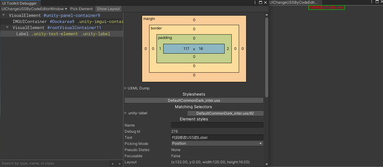
可以看到通过访问style属性并修改其中的color属性,我成功的修改了标题文本的颜色显示风格。更多的属性修改参考文档:
IStyle
使用USS指定UI风格 第一步依然是使用Create->UI Toolkit->Editor WIndow
去掉UXML勾选,这里依然只通过代码和USS文件创建UI显示。
UIUseUSSEditorWindow.cs
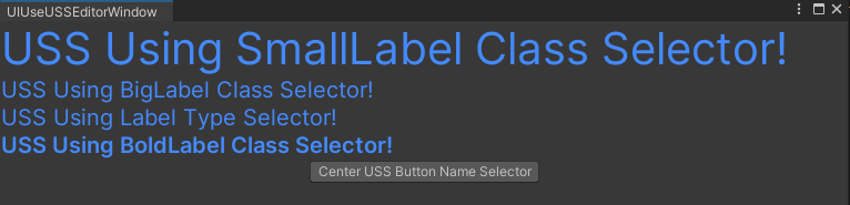
1
2
3
4
5
6
7
8
9
10
11
12
13
14
15
16
17
18
19
20
21
22
23
24
25
26
27
28
29
30
31
32
33
34
35
36
37
38
39
40
41
42
public class UIUseUSSEditorWindow : EditorWindow { [MenuItem("Window/UI Toolkit/UIToolkitStudy/UIUseUSSEditorWindow" ) ] public static void ShowUIUseUSSEditorWidnow () { UIUseUSSEditorWindow wnd = GetWindow<UIUseUSSEditorWindow>(); wnd.titleContent = new GUIContent("UIUseUSSEditorWindow" ); } public void CreateGUI () { CreateUIByUseUSS(); } private void CreateUIByUseUSS () { VisualElement root = rootVisualElement; var styleSheet = AssetDatabase.LoadAssetAtPath<StyleSheet>("Assets/Scripts/Editor/UIToolkitStudy/UIUseUSSEditorWindow/UIUseUSSEditorWindow.uss" ); root.styleSheets.Add(styleSheet); VisualElement smallLabelWithStyle = new Label("USS Using SmallLabel Class Selector!" ); smallLabelWithStyle.AddToClassList("SmallLabel" ); VisualElement bigLabelWithStyle = new Label("USS Using BigLabel Class Selector!" ); smallLabelWithStyle.AddToClassList("BigLabel" ); VisualElement labelWithStyle = new Label("USS Using Label Type Selector!" ); VisualElement boldLabelWithStyle = new Label("USS Using BoldLabel Class Selector!" ); boldLabelWithStyle.AddToClassList("BoldLabel" ); root.Add(smallLabelWithStyle); root.Add(bigLabelWithStyle); root.Add(labelWithStyle); root.Add(boldLabelWithStyle); Button ussCenterButton = new Button(); ussCenterButton.name = "CenterButton" ; ussCenterButton.text = "Center USS Button Name Selector" ; root.Add(ussCenterButton); } }
UIUseUSSEditorWindow.uss
1
2
3
4
5
6
7
8
9
10
11
12
13
14
15
16
17
18
19
20
21
22
23
24
25
Label { font-size: 20px; color: rgb(68, 138, 255); } .SmallLabel { font-size: 10px; color: rgb(68, 138, 255); } .BigLabel { font-size: 40px; color: rgb(68, 138, 255); } .BoldLabel { font-size: 20px; -unity-font-style: bold; color: rgb(68, 138, 255); } #CenterButton { align-self: center; -unity-text-align: middle-center; }
可以看到我们在UIUseUSSEditorWindow.uss里分别定义了,Type Selector(Label) ,Class Selector(.SmallLabel, .BigLabel, .BoldLabel) ,Name Selector(CenterButton) 。
对应的我们在代码里通过以下三种方式分别指定了Selector:
Type Selector
1 VisualElement labelWithStyle = new Label("USS Using Label Type Selector!" );
Class Selctor
1
2
3
4
5
6
7
VisualElement smallLabelWithStyle = new Label("USS Using SmallLabel Class Selector!" ); smallLabelWithStyle.AddToClassList("SmallLabel" ); VisualElement bigLabelWithStyle = new Label("USS Using BigLabel Class Selector!" ); smallLabelWithStyle.AddToClassList("BigLabel" ); VisualElement labelWithStyle = new Label("USS Using Label Type Selector!" ); VisualElement boldLabelWithStyle = new Label("USS Using BoldLabel Class Selector!" ); boldLabelWithStyle.AddToClassList("BoldLabel" );
Name Selector
1
2
3
Button ussCenterButton = new Button(); ussCenterButton.name = "CenterButton" ; ussCenterButton.text = "Center USS Button Name Selector" ;
位置和排版 第一步依然是使用Create->UI Toolkit->Editor WIndow
去掉UXML勾选,这里依然只通过代码和USS文件创建UI显示。
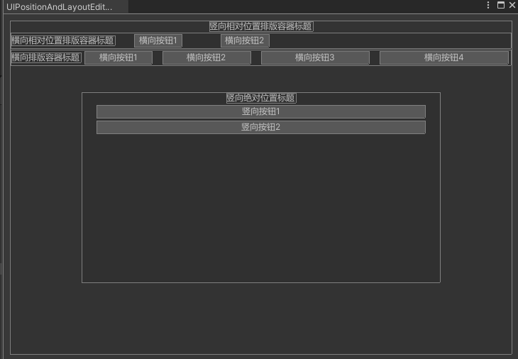
UIPositionAndLayoutEditorWindow.cs
1 2 3 4 5 6 7 8 9 10 11 12 13 14 15 16 17 18 19 20 21 22 23 24 25 26 27 28 29 30 31 32 33 34 35 36 37 38 39 40 41 42 43 44 45 46 47 48 49 50 51 52 53 54 55 56 57 58 59 60 61 62 63 64 65 66 67 68 69 70 71 72 73 74 75 76 77 78 79 80 81 82 83 84 85 86 87 88 89 90 91 92 93 94 95 96 97 98 99 100 101 102 103 104 105 106 107 108 109 110 111 112 113 114 115 116 117 118 119 120 121 122 123 124 125 126 127 128 129 130 131 132 133 134 135 136 137 138 139 140 141 142 143 144 145 146 147 148 149 150 151 152 153 154 155 156 157 158 159 160 161 162 163 164 165 166 167 168 169 170 171 172 173 174 175 176 177 178 179 180 181 182 183 184 185 186 187 188 189 190 191 192 193 194 public class UIPositionAndLayoutEditorWindow : EditorWindow { private VisualElement mRootVerticalRelativePosContainer; [MenuItem("Window/UI Toolkit/UIToolkitStudy/UIPositionAndLayoutEditorWindow" ) ] public static void ShowUIPositionAndLayoutEditorWindow () { UIPositionAndLayoutEditorWindow wnd = GetWindow<UIPositionAndLayoutEditorWindow>(); wnd.titleContent = new GUIContent("UIPositionAndLayoutEditorWindow" ); } public void CreateGUI () { CreatePositionAndLayoutUI(); } private void CreatePositionAndLayoutUI () { CreateRootRelativePosVerticalContainer(); CreateHorizontalRelativePosContainer(); CreateHorzintalLayoutContainer(); CreateVerticalAbsolutePosContainer(); } private void CreateRootRelativePosVerticalContainer () { mRootVerticalRelativePosContainer = new VisualElement(); mRootVerticalRelativePosContainer.style.flexDirection = FlexDirection.Column; mRootVerticalRelativePosContainer.style.position = Position.Relative; mRootVerticalRelativePosContainer.AddToClassList("unity-box" ); mRootVerticalRelativePosContainer.style.marginLeft = 10 ; mRootVerticalRelativePosContainer.style.marginRight = 10 ; mRootVerticalRelativePosContainer.style.marginTop = 10 ; mRootVerticalRelativePosContainer.style.marginBottom = 10 ; mRootVerticalRelativePosContainer.style.flexGrow = 1 ; Label verticalLabel = new Label(); verticalLabel.text = "竖向相对位置排版容器标题" ; verticalLabel.style.alignSelf = Align.Center; mRootVerticalRelativePosContainer.Add(verticalLabel); rootVisualElement.Add(mRootVerticalRelativePosContainer); } private void CreateHorizontalRelativePosContainer () { var horizontalRelativePosContainer = new VisualElement(); horizontalRelativePosContainer.style.flexDirection = FlexDirection.Row; horizontalRelativePosContainer.style.position = Position.Relative; horizontalRelativePosContainer.AddToClassList("unity-box" ); Label horizontalRelativePosLabel = new Label(); horizontalRelativePosLabel.text = "横向相对位置排版容器标题" ; horizontalRelativePosLabel.style.alignSelf = Align.Center; horizontalRelativePosContainer.Add(horizontalRelativePosLabel); Button horizontalButton1 = new Button(); horizontalButton1.text = "横向按钮1" ; horizontalButton1.style.marginLeft = 25 ; Button horizontalButton2 = new Button(); horizontalButton2.text = "横向按钮2" ; horizontalButton2.style.marginLeft = 50f ; horizontalRelativePosContainer.Add(horizontalButton1); horizontalRelativePosContainer.Add(horizontalButton2); mRootVerticalRelativePosContainer.Add(horizontalRelativePosContainer); } private void CreateHorzintalLayoutContainer () { var horizontalLayoutContainer = new VisualElement(); horizontalLayoutContainer.style.flexDirection = FlexDirection.Row; horizontalLayoutContainer.style.flexWrap = Wrap.Wrap; horizontalLayoutContainer.AddToClassList("unity-box" ); Label horizontalLayoutLabel = new Label(); horizontalLayoutLabel.text = "横向排版容器标题" ; horizontalLayoutLabel.style.alignSelf = Align.Center; horizontalLayoutContainer.Add(horizontalLayoutLabel); Button horizontalButton1 = new Button(); horizontalButton1.text = "横向按钮1" ; horizontalButton1.style.flexGrow = 1 ; Button horizontalButton2 = new Button(); horizontalButton2.text = "横向按钮2" ; horizontalButton2.style.flexGrow = 2 ; horizontalButton2.style.marginLeft = 10 ; Button horizontalButton3 = new Button(); horizontalButton3.text = "横向按钮3" ; horizontalButton3.style.flexGrow = 3 ; horizontalButton3.style.marginLeft = 10 ; Button horizontalButton4 = new Button(); horizontalButton4.text = "横向按钮4" ; horizontalButton4.style.flexGrow = 4 ; horizontalButton4.style.marginLeft = 10 ; horizontalLayoutContainer.Add(horizontalButton1); horizontalLayoutContainer.Add(horizontalButton2); horizontalLayoutContainer.Add(horizontalButton3); horizontalLayoutContainer.Add(horizontalButton4); mRootVerticalRelativePosContainer.Add(horizontalLayoutContainer); } private void CreateVerticalAbsolutePosContainer () { var verticalAbsolutePosContainer = new VisualElement(); verticalAbsolutePosContainer.style.flexDirection = FlexDirection.Column; verticalAbsolutePosContainer.style.position = Position.Absolute; verticalAbsolutePosContainer.AddToClassList("unity-box" ); verticalAbsolutePosContainer.style.left = 100 ; verticalAbsolutePosContainer.style.right = 100 ; verticalAbsolutePosContainer.style.top = 100 ; verticalAbsolutePosContainer.style.bottom = 100 ; verticalAbsolutePosContainer.style.flexGrow = 1 ; Label verticalAbsolutePosLabel = new Label(); verticalAbsolutePosLabel.text = "竖向绝对位置标题" ; verticalAbsolutePosLabel.style.alignSelf = Align.Center; verticalAbsolutePosContainer.Add(verticalAbsolutePosLabel); Button verticalButton1 = new Button(); verticalButton1.text = "竖向按钮1" ; verticalButton1.style.height = 20 ; verticalButton1.style.marginLeft = 20 ; verticalButton1.style.marginRight = 20 ; Button verticalButton2 = new Button(); verticalButton2.text = "竖向按钮2" ; verticalButton2.style.height = 20 ; verticalButton2.style.marginLeft = 20 ; verticalButton2.style.marginRight = 20 ; verticalAbsolutePosContainer.Add(verticalButton1); verticalAbsolutePosContainer.Add(verticalButton2); mRootVerticalRelativePosContainer.Add(verticalAbsolutePosContainer); } }
可以看到通过不断创建需要排版的容器设置对应排版和大小属性,我们成功的创建出了各种排版方向以及相对位置和绝对位置的显示UI。
自定义USS变量 在创建USS文件时,我们很多时候会填充相同值给不同的Selector,而修改时并不想一个一个去修改,这个时候就需要用到类似编程上定义变量公用同一个变量的方式。
第一步依然是使用Create->UI Toolkit->Editor WIndow
去掉UXML勾选,这里依然只通过代码和USS文件创建UI显示。
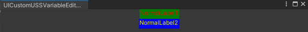
UICustomUSSVariableEditorWindow.cs
1 2 3 4 5 6 7 8 9 10 11 12 13 14 15 16 17 18 19 20 21 22 23 24 25 26 27 28 29 30 31 32 33 34 35 36 37 38 39 40 41 42 43 44 45 46 47 48 49 50 public class UICustomUSSVariableEditorWindow : EditorWindow { [MenuItem("Window/UI Toolkit/UIToolkitStudy/UICustomUSSVariableEditorWindow" ) ] public static void ShowUICustomUSSVariableEditorWindow () { UICustomUSSVariableEditorWindow wnd = GetWindow<UICustomUSSVariableEditorWindow>(); wnd.titleContent = new GUIContent("UICustomUSSVariableEditorWindow" ); } public void CreateGUI () { CreateCustomUSSVariableUI(); } private void CreateCustomUSSVariableUI () { var customUSSVariable1StyleSheet1 = AssetDatabase.LoadAssetAtPath<StyleSheet>("Assets/Scripts/Editor/UIToolkitStudy/UICustomUSSVariableEditorWindow/UICustomUSSVariableEditorWindow1.uss" ); var customUSSVariable1StyleSheet2 = AssetDatabase.LoadAssetAtPath<StyleSheet>("Assets/Scripts/Editor/UIToolkitStudy/UICustomUSSVariableEditorWindow/UICustomUSSVariableEditorWindow2.uss" ); rootVisualElement.styleSheets.Add(customUSSVariable1StyleSheet1); rootVisualElement.styleSheets.Add(customUSSVariable1StyleSheet2); Label normalLabel = new Label(); normalLabel.AddToClassList("NormalLabel" ); normalLabel.text = "NormalLabel1" ; normalLabel.style.left = 10 ; normalLabel.style.right = 10 ; normalLabel.style.height = 20 ; Label normalLabel2 = new Label(); normalLabel2.AddToClassList("NormalLabel2" ); normalLabel2.text = "NormalLabel2" ; normalLabel2.style.left = 10 ; normalLabel2.style.right = 10 ; normalLabel2.style.height = 20 ; rootVisualElement.Add(normalLabel); rootVisualElement.Add(normalLabel2); } }
UICustomUSSVariableEditorWindow1.uss
1
2
3
4
5
6
7
8
9
10
11
12
:root { --text-color: red; --background-color: green; --text-color2: yellow; --background-color2: blue; } .NormalLabel { color: red; background-color: var(--background-color); align-self: center; }
UICustomUSSVariableEditorWindow2.uss
1
2
3
4
5
.NormalLabel2 { color: var(--text-color2); background-color: var(--background-color2); align-self: center; }
可以看到我们在USS文件里自定义了变量并在Class Selector里使用,通过加载多个USS文件,我们实现了跨USS文件的变量定义访问使用。
UXML创建UI 待添加……
VisualElement Query VisualElement查询的核心是通过UQuery和Q相关接口进行对象查询(内部是通过UQueryBuilder构建查询条件)
1 2 3 4 5 6 7 8 9 10 11 12 13 14 15 16 17 18 19 20 21 22 23 24 25 26 27 28 29 private void CreateToolbarUI (){ var menuHorizontalContainer = new VisualElement(); ******* var menuToolbar = new Toolbar(); menuToolbar.name = EventHandleElementNames.MenuToolBarName; ****** menuHorizontalContainer.Add(menuToolbar); rootVisualElement.Add(menuHorizontalContainer); } private void CreateToolbarMenuUI (){ SelectedMenuData = mToolbarMenuDatas[0 ]; var toolbarMenu = new ToolbarMenu(); toolbarMenu.name = EventHandleElementNames.ToolBarMenuName; ****** var menuToolbar = rootVisualElement.Q<Toolbar>(EventHandleElementNames.MenuToolBarName); menuToolbar.Add(toolbarMenu); }
从上面的代码可以看到,我们创建了一个Toolbar并赋值name为EventHandleElementNames.MenuToolBarName,并将Toolbar组件添加到舞台显示。
接着我们创建菜单组件ToolbarMenu,此时想要把ToolbarMenu加到Toolbar里,这个时候我们需要通过rootVisualElement.Q(EventHandleElementNames.MenuToolBarName);的方式查询到Toolbar组件,然后添加到Toolbar作为子组件显示(Toolbar.Add(ToolbarMenu))即可。
自定义Inspector 待学习
Note:
Unity does not support the use of custom property drawers within default inspectors, as Unity makes default inspectors with IMGUI. If you wish to create a custom property drawer, you must also create a custom inspector for the class that uses that property. (Unity不支持自定义属性绘制使用默认Inspector,因为默认Inspector是用得IMGUI实现。如果编写了Custom Property Drawer,那么也必须编写Custom Inspector)
UI事件响应 UI事件监听核心是通过VisualElement.RegisterCallback()方式去监听不同的事件类型来实现事件响应的。
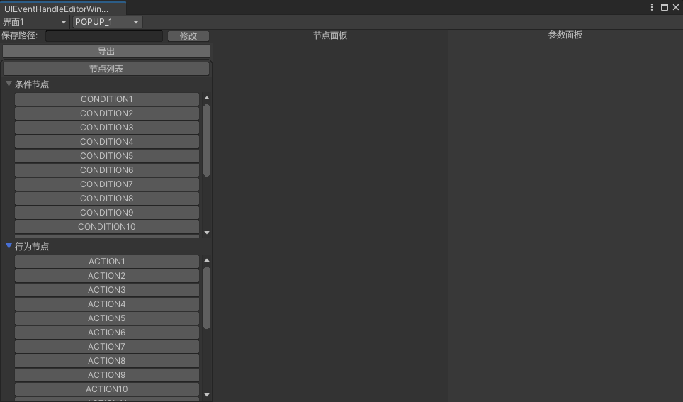
接下来以节点编辑器左侧配置面板的实现为例,让我们看看,我是如何通过构建不同的VisualElement并且监听不同的事件类型来实现不同事件监听响应的。
这里先直接放一张效果图:
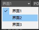
1 2 3 4 5 6 7 8 9 10 11 12 13 14 15 16 17 18 19 20 21 22 23 24 25 26 27 28 29 30 31 32 33 34 35 36 37 38 39 40 41 42 43 44 45 46 47 48 49 50 51 52 53 54 55 56 57 58 59 60 61 62 private List<KeyValuePair<string , ToolbarMenuType>> mToolbarMenuDatas = new List<KeyValuePair<string , ToolbarMenuType>>(){ new KeyValuePair<string , ToolbarMenuType>("界面1" , ToolbarMenuType.PANEL1), new KeyValuePair<string , ToolbarMenuType>("界面2" , ToolbarMenuType.PANEL2), new KeyValuePair<string , ToolbarMenuType>("界面3" , ToolbarMenuType.PANEL3), }; public KeyValuePair<string , ToolbarMenuType> SelectedMenuData;private void CreateToolbarMenuUI (){ SelectedMenuData = mToolbarMenuDatas[0 ]; var toolbarMenu = new ToolbarMenu(); toolbarMenu.name = EventHandleElementNames.ToolBarMenuName; toolbarMenu.text = SelectedMenuData.Key; toolbarMenu.variant = ToolbarMenu.Variant.Popup; toolbarMenu.style.width = 100f ; foreach (var toolbarData in mToolbarMenuDatas) { toolbarMenu.menu.AppendAction(toolbarData.Key, OnToolbarMenuChoice, OnToolbarStatusObtain, toolbarData); } var menuToolbar = rootVisualElement.Q<Toolbar>(EventHandleElementNames.MenuToolBarName); menuToolbar.Add(toolbarMenu); } private void OnToolbarMenuChoice (DropdownMenuAction menuAction ){ var menuData = (KeyValuePair<string , ToolbarMenuType>)menuAction.userData; Debug.Log($"菜单显示名:{menuData.Key} 菜单类型:{menuData.Value} 选中!" ); SelectedMenuData = menuData; var toolbarMenu = rootVisualElement.Q<ToolbarMenu>(EventHandleElementNames.ToolBarMenuName); toolbarMenu.text = SelectedMenuData.Key; } private DropdownMenuAction.Status OnToolbarStatusObtain (DropdownMenuAction menuAction ) { var menuData = (KeyValuePair<string , ToolbarMenuType>)menuAction.userData; Debug.Log($"菜单显示名:{menuData.Key} 菜单类型:{menuData.Value} 响应菜单状态获取!" ); if (SelectedMenuData.Value == menuData.Value) { return DropdownMenuAction.Status.Checked; } return DropdownMenuAction.Status.Normal; }
ToolbarMenu使用流程:
创建ToolbarMenu组件
通过ToolbarMenu.menu.AppendAction(***)传递ToolbarMenu显示内容,菜单选中以及菜单状态获取回调
菜单选中以及菜单状态获取回调里编写菜单的选中以及显示数据处理
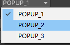
1 2 3 4 5 6 7 8 9 10 11 12 13 14 15 16 17 18 19 20 21 22 23 24 25 26 27 28 29 30 31 32 33 public enum PopupMenuType{ POPUP_1, POPUP_2, POPUP_3, } private void CreatePopupMenuUI (){ var popupMenu = new PopupField<PopupMenuType>(mPopupMenuDatas, mPopupSelectedIndex); popupMenu.style.width = 100f ; popupMenu.RegisterCallback<ChangeEvent<PopupMenuType>>(OnPopupMenuChange); var menuToolbar = rootVisualElement.Q<Toolbar>(EventHandleElementNames.MenuToolBarName); menuToolbar.Add(popupMenu); } private void OnPopupMenuChange (ChangeEvent<PopupMenuType> evt ){ Debug.Log($"弹出菜单选中:{evt.newValue} " ); var popupMenu = evt.target as PopupField<PopupMenuType>; popupMenu.value = evt.newValue; }
ToolbarMenu使用流程:
创建PopupField组件
通过PopupMenu.RegisterCallback<ChangeEvent>(***)注册下拉框切换回调
在下拉框切换回调里处理下拉框切换数据处理
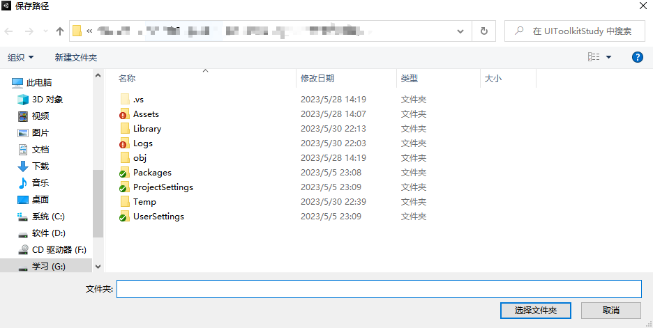
1 2 3 4 5 6 7 8 9 10 11 12 13 14 15 16 17 18 19 20 21 22 23 24 25 26 27 28 29 30 31 32 33 34 35 36 37 38 39 40 41 42 43 44 45 46 47 48 49 50 51 private void CreateSavePathContent (){ var leftVerticalContentContainer = rootVisualElement.Q<VisualElement>(EventHandleElementNames.LeftVerticalContentContainerName); var savePathHorizontalContainer = new VisualElement(); savePathHorizontalContainer.style.left = 0 ; savePathHorizontalContainer.style.right = 0 ; savePathHorizontalContainer.style.height = 20 ; savePathHorizontalContainer.style.flexDirection = FlexDirection.Row; savePathHorizontalContainer.AddToClassList("unity-box" ); var savePathLabelTitle = new Label(); savePathLabelTitle.style.width = 60 ; savePathLabelTitle.text = "保存路径:" ; savePathHorizontalContainer.Add(savePathLabelTitle); var savePathTextField = new TextField(); savePathTextField.name = EventHandleElementNames.SavePathTextFieldName; savePathTextField.style.flexGrow = 1 ; savePathTextField.style.flexShrink = 1 ; savePathTextField.value = GraphSavePath; savePathHorizontalContainer.Add(savePathTextField); var savePathButton = new Button(); savePathButton.style.width = 60 ; savePathButton.text = "修改" ; savePathHorizontalContainer.Add(savePathButton); savePathButton.RegisterCallback<ClickEvent>(OnSavePathButtonClick); leftVerticalContentContainer.Add(savePathHorizontalContainer); } private void OnSavePathButtonClick (ClickEvent clickEvent ){ Debug.Log($"保存路径按钮点击!" ); var newSavePath = EditorUtility.OpenFolderPanel("保存路径" , GraphSavePath, string .Empty); if (!string .IsNullOrEmpty(newSavePath)) { GraphSavePath = newSavePath; Debug.Log($"更新保存路径:{newSavePath} " ); var savePathTextField = rootVisualElement.Q<TextField>(EventHandleElementNames.SavePathTextFieldName); savePathTextField.value = GraphSavePath; } }
Button使用流程:
创建Button组件
通过Button.RegisterCallback(***)注册下按钮点击回调
在按钮点击回调处理点击后的响应逻辑
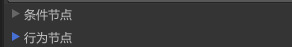
Foldout(折叠) 1 2 3 4 5 6 7 8 9 10 11 12 13 14 15 16 17 18 19 20 21 22 23 24 25 26 27 28 29 30 31 32 33 34 35 36 37 38 39 40 41 42 43 44 45 46 47 48 49 50 51 52 53 54 55 56 private void CreateConditionNodeUI (){ var conditionNodeFoldOut = new Foldout(); conditionNodeFoldOut.name = EventHandleElementNames.ConditionNodeFoldOutName; conditionNodeFoldOut.viewDataKey = EventHandleViewDataKeys.ConditionNodeFoldOutViewDataKeyName; conditionNodeFoldOut.text = "条件节点" ; conditionNodeFoldOut.AddToClassList("unity-box" ); ****** conditionNodeFoldOut.RegisterValueChangedCallback(OnConditionNodeFoldOutValueChange); var nodeVerticalContainer = rootVisualElement.Q<VisualElement>(EventHandleElementNames.NodeVerticalContainerName); nodeVerticalContainer.Add(conditionNodeFoldOut); } private void CreateActionNodeUI (){ var actionNodeFoldOut = new Foldout(); actionNodeFoldOut.name = EventHandleElementNames.ActionNodeFoldOutName; actionNodeFoldOut.viewDataKey = EventHandleViewDataKeys.ActionNodeFoldOutViewDataKeyName; actionNodeFoldOut.text = "行为节点" ; actionNodeFoldOut.AddToClassList("unity-box" ); ****** actionNodeFoldOut.RegisterValueChangedCallback(OnActionNodeFoldOutValueChange); var nodeVerticalContainer = rootVisualElement.Q<VisualElement>(EventHandleElementNames.NodeVerticalContainerName); nodeVerticalContainer.Add(actionNodeFoldOut); } private void OnConditionNodeFoldOutValueChange (ChangeEvent<bool > changeEvent ){ Debug.Log($"响应条件节点折叠值更新:{changeEvent.newValue} " ); } private void OnActionNodeFoldOutValueChange (ChangeEvent<bool > changeEvent ){ Debug.Log($"响应行为节点折叠值更新:{changeEvent.newValue} " ); }
Foldout使用流程:
创建Foldout组件
通过FoldOut.RegisterValueChangedCallback(***)注册折叠变化回调
在折叠变化回调处理折叠变化响应逻辑
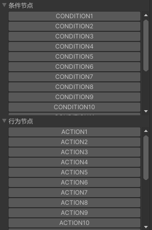
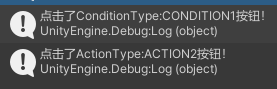
ListView(列表) 1 2 3 4 5 6 7 8 9 10 11 12 13 14 15 16 17 18 19 20 21 22 23 24 25 26 27 28 29 30 31 32 33 34 35 36 37 38 39 40 41 42 43 44 45 46 47 48 49 50 51 52 53 54 55 56 57 58 59 60 61 62 63 64 65 66 67 68 69 70 71 72 73 74 75 76 77 78 79 80 81 82 83 84 85 86 87 88 89 90 91 92 93 94 95 96 97 98 99 100 101 102 103 104 105 106 107 108 109 110 111 112 113 114 115 116 117 118 119 120 121 122 123 124 125 126 127 128 129 130 131 132 133 134 135 136 137 138 139 140 141 142 143 144 145 146 147 148 149 150 151 152 153 154 155 156 public enum ActionType{ ACTION1, ACTION2, ******, ACTION20, } public enum ConditionType{ CONDITION1, CONDITION2, ******, CONDITION20, } private List<ActionType> mActionTypeList = new List<ActionType>();private List<ConditionType> mConditionTypeList = new List<ConditionType>();private void InitNodeDatas (){ mActionTypeList.Clear(); var actionTypes = Enum.GetValues(typeof (ActionType)); foreach (var actionType in actionTypes) { mActionTypeList.Add((ActionType)actionType); } mConditionTypeList.Clear(); var conditionTypes = Enum.GetValues(typeof (ConditionType)); foreach (var conditionType in conditionTypes) { mConditionTypeList.Add((ConditionType)conditionType); } } private void CreateConditionNodeUI (){ var conditionNodeFoldOut = new Foldout(); ****** var conditionListView = new ListView(mConditionTypeList, 20 , OnMakeNodeItem, OnBindConditionItem); conditionListView.style.height = 300 ; conditionNodeFoldOut.Add(conditionListView); ****** } private void CreateActionNodeUI (){ var actionNodeFoldOut = new Foldout(); ****** var actionListView = new ListView(mConditionTypeList, 20 , OnMakeNodeItem, OnBindActionItem); actionListView.style.height = 300 ; actionNodeFoldOut.Add(actionListView); ****** } private void OnBindConditionItem (VisualElement conditionItem, int index ){ var conditionButton = conditionItem as Button; conditionButton.name = GetConditionItemNameByIndex(index); conditionButton.text = mConditionTypeList[index].ToString(); conditionButton.userData = mConditionTypeList[index]; conditionButton.RegisterCallback<ClickEvent>(OnBindConditionItemButtonClick); } private void OnBindActionItem (VisualElement conditionItem, int index ){ var actionButton = conditionItem as Button; actionButton.name = GetActionItemNameByIndex(index); actionButton.text = mActionTypeList[index].ToString(); actionButton.userData = mActionTypeList[index]; actionButton.RegisterCallback<ClickEvent>(OnBindActionItemButtonClick); } private VisualElement OnMakeNodeItem (){ return new Button(); } private void OnBindConditionItemButtonClick (ClickEvent clickEvent ){ var conditionItemButton = clickEvent.target as Button; var clickConditionType = (ConditionType)conditionItemButton.userData; Debug.Log($"点击了ConditionType:{clickConditionType} 按钮!" ); } private void OnBindActionItemButtonClick (ClickEvent clickEvent ){ var actionItemButton = clickEvent.target as Button; var clickActionType = (ActionType)actionItemButton.userData; Debug.Log($"点击了ActionType:{clickActionType} 按钮!" ); } private string GetConditionItemNameByIndex (int index{ return $"{EventHandleElementNames.ConditionItemPrefixName} {mConditionTypeList[index]} " ; } private string GetActionItemNameByIndex (int index{ return $"{EventHandleElementNames.ActionItemPrefixName} {mActionTypeList[index]} " ; }
ListView使用流程:
创建ListView组件
创建ListView组件时传递需要显示的数据,高度,列表组件构造回调以及列表组件绑定回调
在列表组件构造回调里构建我们列表里需要显示的VisualElement
在列表组件绑定回调里处理列表组件的详细逻辑处理
更多的事件响应待添加……
数据绑定 数据绑定组件 通过前面对于属性绑定的基础学习:
SerializedObject Data Binding
可以知道,对于VisualElement和属性的绑定核心通过以下几个接口:
Bind() Unbind() bindingPath BindProperty()
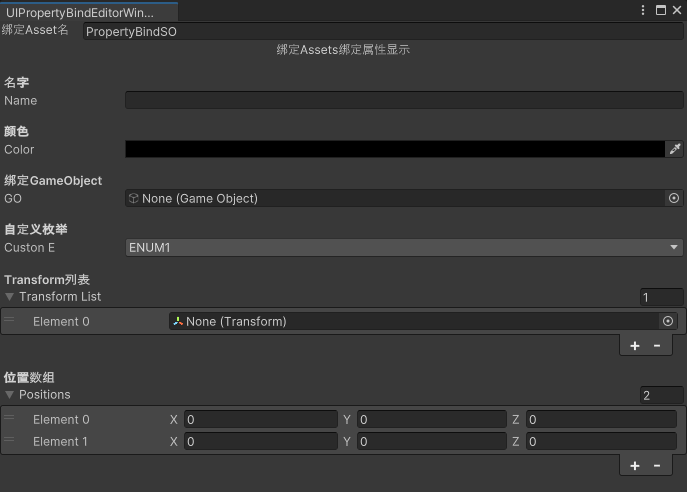
UIPropertyBindEditorWindow.cs
1 2 3 4 5 6 7 8 9 10 11 12 13 14 15 16 17 18 19 20 21 22 23 24 25 26 27 28 29 30 31 32 33 34 35 36 37 38 39 40 41 42 43 44 45 46 47 48 49 50 51 52 53 54 55 56 57 58 59 60 61 62 63 64 65 66 67 68 69 70 71 72 73 74 75 76 77 78 79 80 81 82 83 84 85 86 87 88 89 90 91 92 93 94 95 96 97 98 99 100 101 102 103 104 105 106 107 108 109 110 111 112 113 114 115 116 117 118 119 120 121 122 123 124 125 126 public class UIPropertyBindEditorWindow : EditorWindow { private ScriptableObject mSelectedScriptableObject; [MenuItem("Window/UI Toolkit/UIToolkitStudy/UIPropertyBindEditorWindow" ) ] public static void ShowUIPropertyBindEditorWindow () { UIPropertyBindEditorWindow wnd = GetWindow<UIPropertyBindEditorWindow>(); wnd.titleContent = new GUIContent("UIPropertyBindEditorWindow" ); } public void CreateGUI () { CreatePropertyBindUI(); OnSelectionChange(); } private void OnSelectionChange () { mSelectedScriptableObject = Selection.activeObject as ScriptableObject; var propertyBindAssetNameTextField = rootVisualElement.Q<TextField>(PropertyBindElementNames.PropertyBindTextFieldName); var propertyBindInfoContentContainer = rootVisualElement.Q<VisualElement>(PropertyBindElementNames.PropertyBindInfoContentContainerName); if (mSelectedScriptableObject != null ) { var selectedSerializedObject = new SerializedObject(mSelectedScriptableObject); if (propertyBindAssetNameTextField != null ) { var nameProperty = selectedSerializedObject.FindProperty("m_Name" ); propertyBindAssetNameTextField.BindProperty(nameProperty); } if (propertyBindInfoContentContainer != null ) { var propertyIterator = selectedSerializedObject.GetIterator(); propertyIterator.NextVisible(true ); while (propertyIterator.NextVisible(false )) { var propertyField = new PropertyField(); propertyField.name = propertyIterator.name; propertyField.style.height = 20 ; propertyField.BindProperty(propertyIterator); propertyBindInfoContentContainer.Add(propertyField); } } } else { if (propertyBindAssetNameTextField != null ) { propertyBindAssetNameTextField.Unbind(); propertyBindAssetNameTextField.value = string .Empty; } if (propertyBindInfoContentContainer != null ) { propertyBindInfoContentContainer.Clear(); } } } private void CreatePropertyBindUI () { CreatePropertyBindAssetInfoUI(); CreatePropertyBindPropertyUI(); } private void CreatePropertyBindAssetInfoUI () { var propertyBindAssetInfoHContainer = new VisualElement(); propertyBindAssetInfoHContainer.style.flexDirection = FlexDirection.Row; propertyBindAssetInfoHContainer.style.height = 20 ; rootVisualElement.Add(propertyBindAssetInfoHContainer); var propertyBindLabelTitle = new Label(); propertyBindLabelTitle.text = "绑定Asset名" ; propertyBindLabelTitle.style.width = 80 ; propertyBindAssetInfoHContainer.Add(propertyBindLabelTitle); var propertyBindAssetNameTextField = new TextField(); propertyBindAssetNameTextField.name = PropertyBindElementNames.PropertyBindTextFieldName; propertyBindAssetNameTextField.style.flexGrow = 1 ; propertyBindAssetNameTextField.value = string .Empty; propertyBindAssetInfoHContainer.Add(propertyBindAssetNameTextField); } private void CreatePropertyBindPropertyUI () { var propertyBindInfoVContainer = new VisualElement(); propertyBindInfoVContainer.style.flexDirection = FlexDirection.Column; propertyBindInfoVContainer.style.left = 0 ; propertyBindInfoVContainer.style.right = 0 ; propertyBindInfoVContainer.style.top = 0 ; propertyBindInfoVContainer.style.bottom = 0 ; propertyBindInfoVContainer.style.flexGrow = 1 ; propertyBindInfoVContainer.AddToClassList("unity-rect-field" ); rootVisualElement.Add(propertyBindInfoVContainer); var propertyBindInfoLabelTitle = new Label(); propertyBindInfoLabelTitle.text = "绑定Assets绑定属性显示" ; propertyBindInfoLabelTitle.style.alignSelf = Aligh.Center; propertyBindInfoLabelTitle.style.height = 20 ; propertyBindInfoVContainer.Add(propertyBindInfoLabelTitle); var propertyBindInfoContentContainer = new VisualElement(); propertyBindInfoContentContainer.name = PropertyBindElementNames.PropertyBindInfoContentContainerName; propertyBindInfoContentContainer.style.flexDirection = FlexDirection.Column; propertyBindInfoContentContainer.style.flexGrow = 1 ; propertyBindInfoVContainer.Add(propertyBindInfoContentContainer); } }
PropertyBindSO.cs
1 2 3 4 5 6 7 8 9 10 11 12 13 14 15 16 17 18 19 20 21 22 23 24 25 26 27 28 29 30 31 32 33 34 35 36 37 38 39 40 41 42 43 44 45 46 47 48 49 50 51 52 53 54 55 56 57 58 59 [CreateAssetMenu(fileName = "PropertyBindSO" , menuName = "ScriptableObjects/DIY/PropertyBindSO" , order = 1) ] public class PropertyBindSO : ScriptableObject { public enum CustomEnum { ENUM1, ENUM2, ENUM3, } [Header("名字" ) ] public string Name; [Header("颜色" ) ] public Color Color; [Header("绑定GameObject" ) ] public GameObject GO; [Header("自定义枚举" ) ] public CustonEnum CustonE; [Header("Transform列表" ) ] public List<Transform> TransformList; [Header("位置数组" ) ] public Vector3[] Positions; [Header("自定义Class" ) ] public CustomBindClass BindClass; }
从上面截图可以看到,通过Selection.activeObject得到选中的ScriptableObject对象,结合selectedSerializedObject.GetIterator()遍历添加所有可视化属性展示(PropertyField),同时通过TextField.BindProperty()绑定文本和特定属性显示从而实现属性绑定VisualElement的效果。
当我们未选中任何对象时我们通过Unbind()接口接触VisualElement的属性绑定效果。
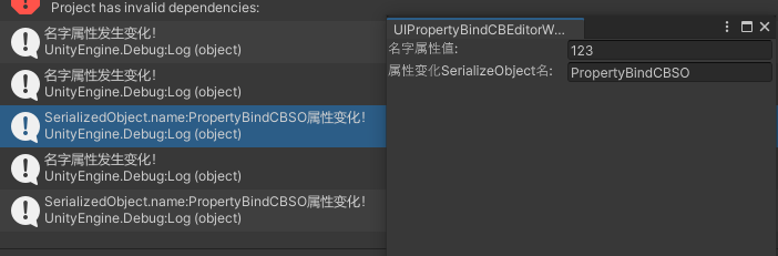
数据绑定UI变化回调 数据绑定变化回调核心通过以下几个接口:
TrackPropertyValue() TrackSerializedObjectValue()
UIPropertyBindCBEditorWindow.cs
1 2 3 4 5 6 7 8 9 10 11 12 13 14 15 16 17 18 19 20 21 22 23 24 25 26 27 28 29 30 31 32 33 34 35 36 37 38 39 40 41 42 43 44 45 46 47 48 49 50 51 52 53 54 55 56 57 58 59 60 61 62 63 64 65 66 67 68 69 70 71 72 73 74 75 76 77 78 79 80 81 82 83 84 85 86 87 88 89 90 91 92 93 94 95 96 97 98 99 100 101 102 103 104 105 106 107 108 109 110 111 112 113 114 115 116 117 118 119 120 121 public class UIPropertyBindCBEditorWindow : EditorWindow { private ScriptableObject mSelectedScriptableObject; [MenuItem("Window/UI Toolkit/UIToolkitStudy/UIPropertyBindCBEditorWindow" ) ] public static void ShowUIPropertyBindCBEditorWindow () { UIPropertyBindCBEditorWindow wnd = GetWindow<UIPropertyBindCBEditorWindow>(); wnd.titleContent = new GUIContent("UIPropertyBindCBEditorWindow" ); } public void CreateGUI () { CreatePropertyBindCBUI(); OnSelectionChange(); } private void OnSelectionChange () { mSelectedScriptableObject = Selection.activeObject as ScriptableObject; var propertyBindAssetNameTextField = rootVisualElement.Q<TextField>(PropertyBindCBElementNames.PropertyBindCBTextFieldName); var serializedBindAssetNameTextField = rootVisualElement.Q<TextField>(PropertyBindCBElementNames.SerializedBindCBTextFieldName); if (mSelectedScriptableObject != null ) { var selectedSerializedObject = new SerializedObject(mSelectedScriptableObject); if (propertyBindAssetNameTextField != null ) { var nameProperty = selectedSerializedObject.FindProperty("Name" ); propertyBindAssetNameTextField.TrackPropertyValue(nameProperty, OnNamePropertyChange); propertyBindAssetNameTextField.BindProperty(nameProperty); } if (serializedBindAssetNameTextField != null ) { serializedBindAssetNameTextField.TrackSerializedObjectValue(selectedSerializedObject, OnPropertyChange); } } else { if (propertyBindAssetNameTextField != null ) { propertyBindAssetNameTextField.Unbind(); propertyBindAssetNameTextField.value = string .Empty; } if (serializedBindAssetNameTextField != null ) { serializedBindAssetNameTextField.Unbind(); } } } private void CreatePropertyBindCBUI () { var propertyBindCBAssetInfoHContainer = new VisualElement(); propertyBindCBAssetInfoHContainer.style.flexDirection = FlexDirection.Row; propertyBindCBAssetInfoHContainer.style.height = 20 ; rootVisualElement.Add(propertyBindCBAssetInfoHContainer); var proeprtyBindLabelTitle = new Label(); proeprtyBindLabelTitle.text = "名字属性值:" ; proeprtyBindLabelTitle.style.width = 160 ; propertyBindCBAssetInfoHContainer.Add(proeprtyBindLabelTitle); var propertyBindAssetNameTextField = new TextField(); propertyBindAssetNameTextField.name = PropertyBindCBElementNames.PropertyBindCBTextFieldName; propertyBindAssetNameTextField.style,flexGrow = 1 ; propertyBindAssetNameTextField.value = string .Empty; propertyBindCBAssetInfoHContainer.Add(propertyBindAssetNameTextField); var serializedObjectBindCBAssetInfoHContainer = new VisualElement(); serializedObjectBindCBAssetInfoHContainer.style.flexDirection = FlexDirection.Row; serializedObjectBindCBAssetInfoHContainer.style.height = 20 ; rootVisualElement.Add(serializedObjectBindCBAssetInfoHContainer); var serializedBindLabelTitle = new Label(); serializedBindLabelTitle.text = "属性变化SerializeObject名:" ; serializedBindLabelTitle.style.width = 160 ; serializedObjectBindCBAssetInfoHContainer.Add(serializedBindLabelTitle); var serializedBindAssetNameTextField = new TextField(); serializedBindAssetNameTextField.name = PropertyBindCBElementNames.SerializedBindCBTextFieldName; serializedBindAssetNameTextField.style.flexGrow = 1 ; serializedBindAssetNameTextField.value = string .Empty; serializedObjectBindCBAssetInfoHContainer.Add(serializedBindAssetNameTextField); } private void OnNamePropertyChange (SerializedProperty property ) { Debug.Log($"名字属性发生变化!" ); } private void OnPropertyChange (SerializedObject serializedObject ) { Debug.Log($"SerializedObject.name:{serializedObject.targetObject.name} 属性变化!" ); var serializedBindAssetNameTextField = rootVisualElement.Q<TextField>(PropertyBindCBElementNames.SerializedBindCBTextFieldName); if (serializedBindAssetNameTextField != null ) { serializedBindAssetNameTextField.value = serializedObject.targetObject.name; } } }
PropertyBindCBSO.cs
1 2 3 4 5 6 7 8 9 10 11 12 13 14 15 16 17 18 19 20 21 22 23 24 25 26 27 28 29 30 31 [CreateAssetMenu(fileName = "PropertyBindCBSO" , menuName = "ScriptableObjects/DIY/PropertyBindCBSO" , order = 1) ] public class PropertyBindCBSO : ScriptableObject { [Header("名字" ) ] public string Name; [Header("位置" ) ] public Vector3 Position; [Header("颜色" ) ] public Color Color; [Header("绑定GameObject" ) ] public GameObject GO; }
从上面代码可以看到我通过TextField绑定指定属性后调用TrackPropertyValue实现指定属性变化回调监听。
通过TextField调用TrackSerializedObjectValue实现对指定SerializedObject所有属性变化的监听。
知识点
EditorWindow.CreateGUI()方法是用于UIToolkit创建Editor窗口的rootVisualElement显示方法 Editor.CreateInspectorGUI()方法是用于UIToolkit创建自定义Inspector面板的显示方法 UI Toolkit to create Editor UI and synchronize data between a property and a visual element for the Editor UI. (UIToolkit支持在Editor UI上同步属性数据到Visual Element上)
行为树节点编辑器实战 详情参考:行为树节点编辑器
Github 个人Github:
UnityEditor知识
UIToolkit
Reference Creating user interfaces (UI)
CSS
USS properties reference
IStyle
UXML现有可用Element查询
USS built-in variable references
Event Reference
Graph Tools Foundation 0.11